nature pictures
For our first day of this module we had to go outside and take pictures of nature, we would put this in a big database created by ourselves and use these pictures later in the project for making our own poster series.


physical experiments
Beside the pictures we had to grab atleast 15 different materials to use in physical experimenting, these experiments would also be put in our database to use for our posters.


Digital experiments
This part is where the fun for me started, the digital experimenting.
At this point of the module we switched from doing everything with our hands to working digitally, we had to use the pictures we took outside and the pictures of our physical work to create as much experiments as we could.


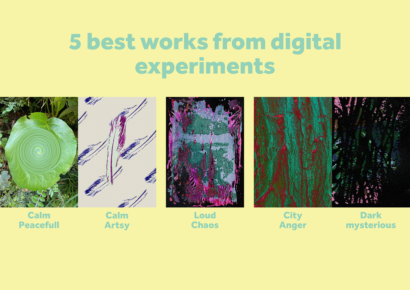
For each of the 5 best works we had to pick a typeface/font.
I found alot of fonts usable with every work since I loved to use contrast but using fonts that used the same style as the works also looked very good and in tone.
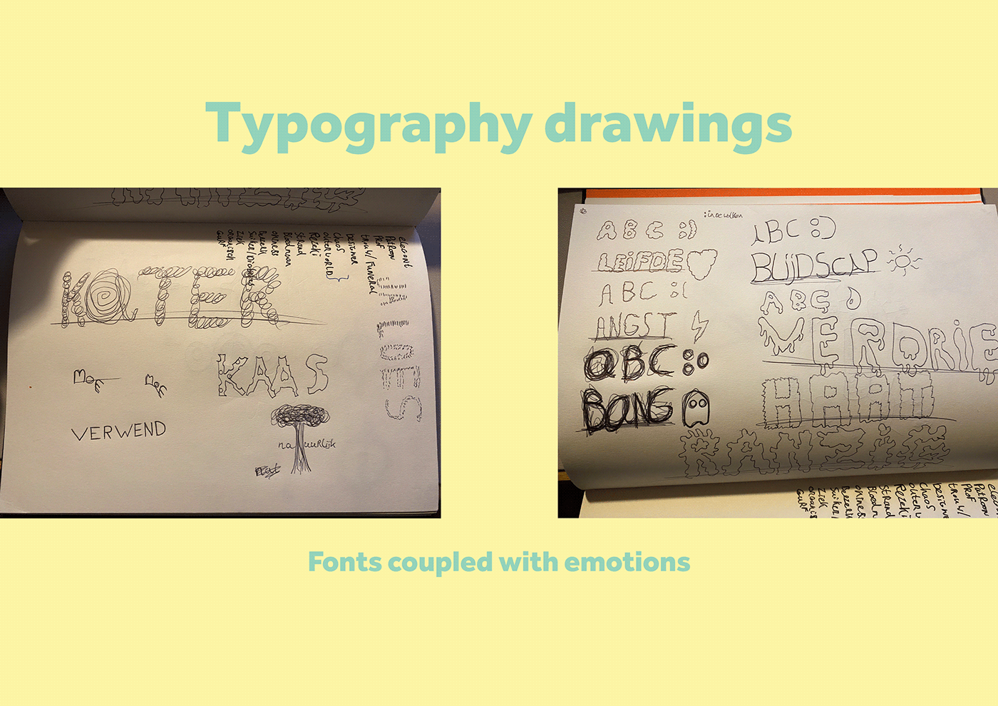
Typography
For this part of the project we had to create our own ' fonts' out of emotions. I tried to make fonts from looking at the words in many ways, I would try to do this methaporically or very literal. working with simple styles and create abc, writing the word itself and making a tiny symbol that suits the font.
Helvetica
For this part we needed to create poster for Helvetica' s 60th anniversary. I actually used Helvetica for a lot of the typing in this project page. Working with a list of requirements that had to be put into the poster.
The list of requirements consisted of:
Helvetica
60th anniversary
1957-2017
The colors that had to be used in the poster: black, white and red.

Guide layouts
Here I will show what guide layout I used to create the posters.

Poster series
The final project and the one that took the most time, I started from scratch a lot, and reset a lot. Here I will show some process and at the end my final product.
The first thought web

Not being exited enough with the idea of making a product poster I started thinking again of what I wanted to create. So I started digging into my hobbies and interests. Then I decided to create 3 different poster for Christopher Nolan movies. I love his movies and the way he uses his knowledge to create his stories and cinematography.


The final 3 posters
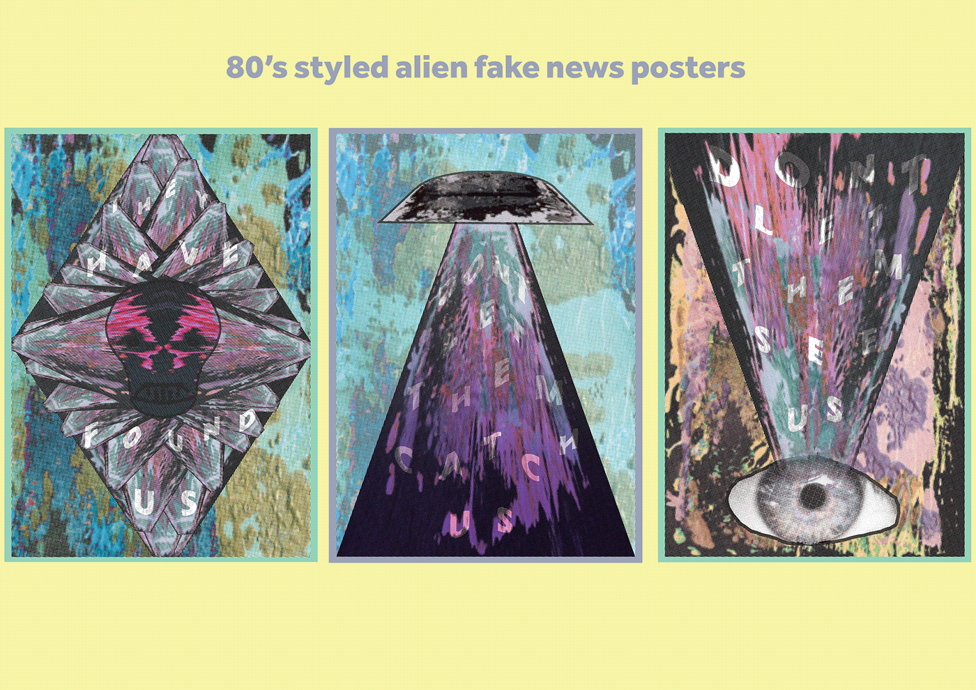
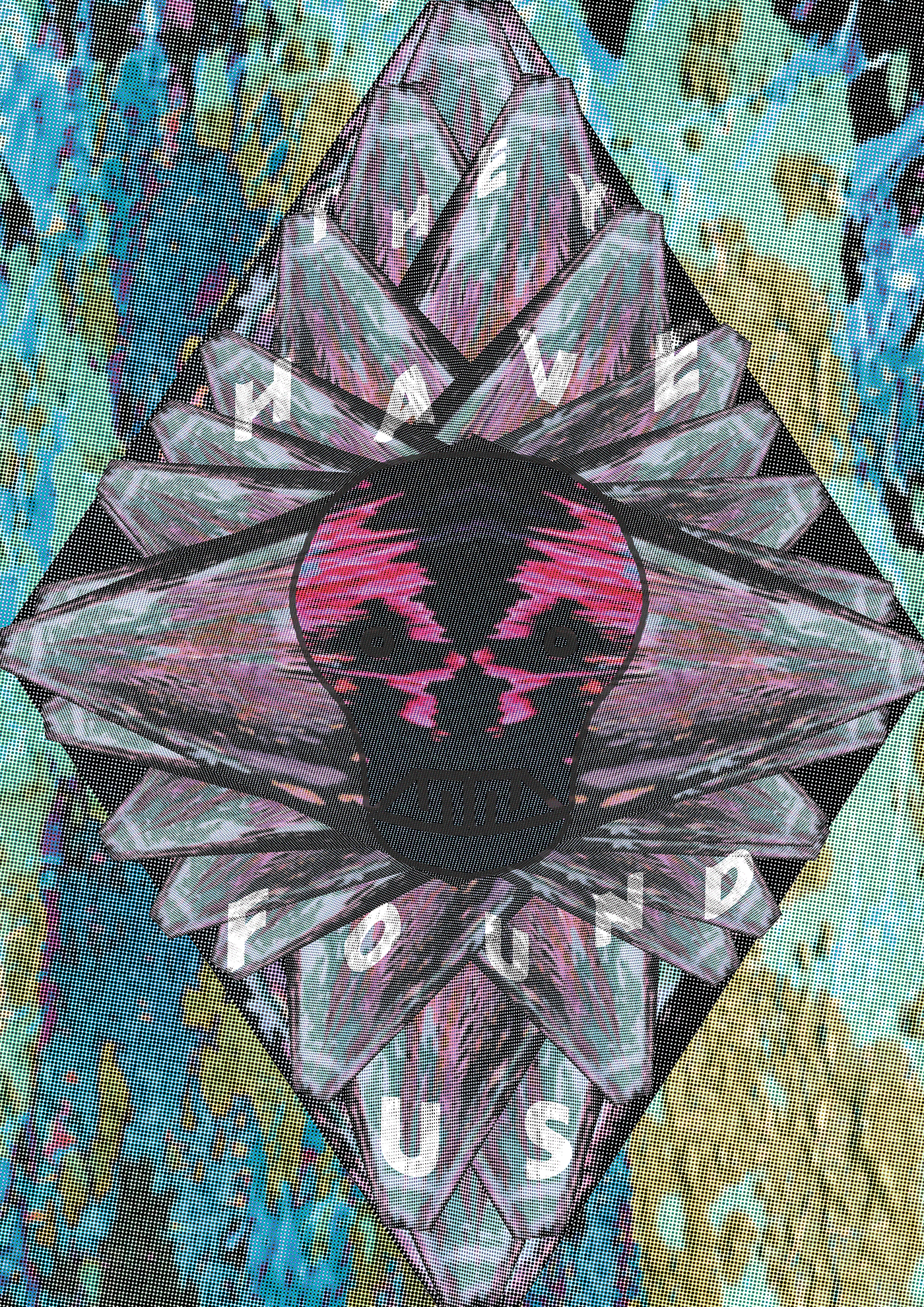
I used halftone filters to give it a more 80's style and using bright colors but making them a bit calmer.
The typography used in these posters was Niveau Grotesk
using only the experiment I created at digital experimenting.


Here I will show of all three posters in full size
The first poster I created and my favorite as well.
The UFO

My second poster I created wanting to make us feel watched and uncomfortable.
The EYE

And for my last poster I wanted us to be found a follow up to the last two posters.
The Creature